Beyond Pixels: The Art and Science of App Design & UI/UX
In today’s crowded digital marketplace, an app is more than just a collection of features; it’s an experience. Just as a beautifully designed physical product can captivate and delight, a well-designed mobile application can forge a powerful connection with its users, fostering loyalty and driving success. This is where App Design and UI/UX (User Interface/User Experience) come into play – the twin pillars that elevate an app from mere functionality to an indispensable tool in a user’s daily life.
This comprehensive guide will delve into the intricate world of app design, exploring the fundamental principles, best practices, and cutting-edge trends that define truly exceptional mobile experiences. Whether you’re a budding designer, a developer looking to enhance your app’s appeal, or a business owner aiming to build a successful mobile product, understanding the nuances of UI/UX is paramount.
The Foundation: Defining UI and UX
While often used interchangeably, UI and UX are distinct yet deeply interconnected disciplines:
- User Experience (UX): The “Why,” “What,” and “How” of Product Use UX design focuses on the overall feeling and ease of use when interacting with an app. It’s about how a user feels before, during, and after using the product. A UX designer’s role is to understand user needs, motivations, and pain points, then craft a seamless and enjoyable journey to achieve their goals within the app.
- Key Questions UX Addresses: Is the app easy to navigate? Is it intuitive? Does it solve a real problem for the user? Is the user’s journey efficient and satisfying?
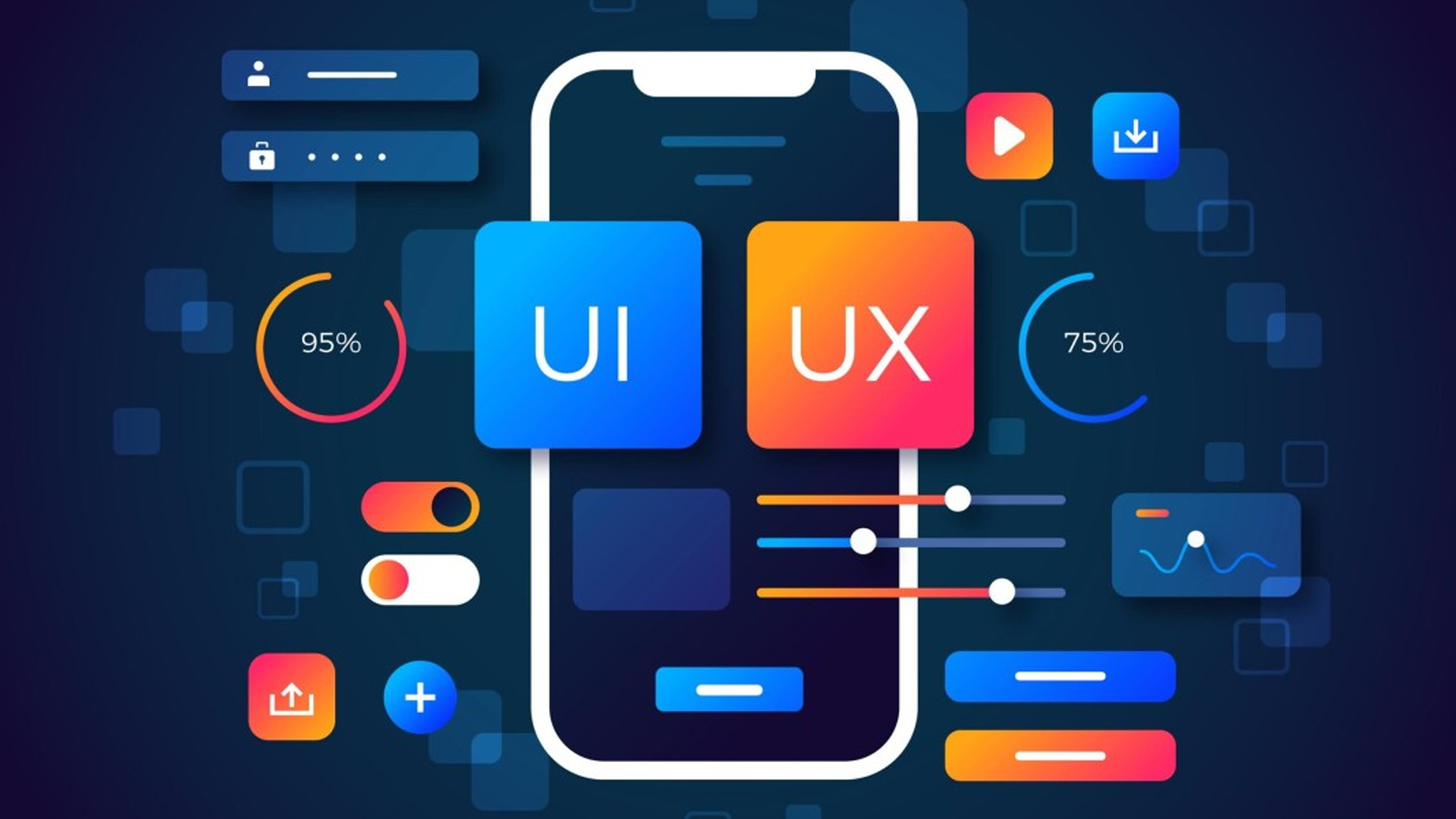
- User Interface (UI): The “Look and Feel” of an App UI design is the graphical layout of an application. It encompasses all the visual elements a user interacts with: buttons, icons, typography, color schemes, imagery, and animations. A UI designer’s goal is to create an aesthetically pleasing and visually cohesive interface that guides the user effortlessly through the app’s functionalities.
- Key Questions UI Addresses: Is the app visually appealing? Are the buttons clearly identifiable? Is the text legible? Does the design reflect the brand’s identity?
Think of it this way: If an app were a car, UX would be how it feels to drive – the smoothness of the ride, the comfort of the seats, the ease of handling. UI would be the dashboard – the layout of the gauges, the design of the steering wheel, the color of the interior lighting. Both are crucial for a great driving experience.
The App Design Process: A User-Centric Journey
Effective app design is not a single step but an iterative process rooted in user understanding. Here’s a typical design workflow:
- Discovery & Research:
- Understanding the “Why”: What problem does the app solve? What are the business goals?
- User Research: Conduct surveys, interviews, and focus groups to understand target users, their demographics, behaviors, needs, and pain points. Create user personas (fictional representations of your ideal users) to empathize with their perspectives.
- Competitor Analysis: Analyze existing apps in your niche to identify strengths, weaknesses, and opportunities for differentiation.
- Information Architecture (IA): Structuring the Content
- User Flows/Journeys: Map out the paths users will take to complete specific tasks within the app. This helps identify potential roadblocks and optimize navigation.
- Sitemaps: Create a hierarchical structure of the app’s content and features, outlining how different screens and functionalities connect. This ensures logical organization.
- Wireframing: The Blueprint
- Low-Fidelity Wireframes: Basic, skeletal layouts of app screens, focusing solely on content placement, hierarchy, and functionality. These are often hand-drawn or created with simple digital tools, allowing for rapid iteration without getting bogged down in visual details. They answer: “What goes where?”
- Prototyping: Bringing It to Life (Without Code)
- Interactive Prototypes: Convert wireframes into clickable, interactive simulations of the app. These can range from low-fidelity (basic navigability) to high-fidelity (mimicking the final look and feel). Prototyping allows stakeholders and users to experience the app’s flow and provide feedback before any code is written, saving significant time and resources.
- UI Design: The Visual Polish
- Visual Elements: Apply color palettes, typography, iconography, imagery, and branding elements.
- Layout and Grids: Ensure consistent spacing, alignment, and visual hierarchy.
- Component Design: Design individual UI elements like buttons, input fields, navigation bars, and cards to be visually appealing and functional.
- Animations and Microinteractions: Incorporate subtle animations and feedback loops to enhance user engagement and provide visual cues.
- Usability Testing:
- Gathering Feedback: Put prototypes or early versions of the app in front of real users. Observe how they interact, identify pain points, and gather qualitative and quantitative feedback.
- Iterate and Refine: Use the feedback to make informed design decisions, iterating on the design until it meets user needs and business objectives. This step is continuous throughout the development lifecycle.
- Handoff to Development:
- Design Specifications: Provide developers with detailed design specifications, including measurements, asset exports, typography guidelines, and interaction specifications. Tools like Figma, Sketch, and Adobe XD facilitate this handoff.
Core Principles of Exceptional App Design
While trends may come and go, certain fundamental principles remain timeless for creating successful app designs:
- User-Centricity: Always put the user first. Every design decision should stem from an understanding of user needs, behaviors, and goals.
- Simplicity & Clarity: Avoid clutter. A clean, uncluttered interface reduces cognitive load and makes it easier for users to find what they need. Every element should serve a purpose.
- Consistency: Maintain a consistent visual language and interaction patterns throughout the app. This builds familiarity and reduces the learning curve. Consistency applies to colors, fonts, button styles, icon usage, and navigation.
- Intuitive Navigation: Users should never feel lost. Clear, predictable, and easy-to-discover navigation is crucial. Common patterns include tab bars, navigation bars, and hamburger menus (used sparingly for secondary navigation).
- Feedback and Responsiveness: Apps should provide immediate feedback to user actions (e.g., a button changing color when tapped, a loading spinner). This assures users that their input has been received.
- Accessibility: Design for everyone. Consider users with disabilities by implementing features like high-contrast modes, dynamic type for adjustable font sizes, and screen reader compatibility. Adhere to WCAG (Web Content Accessibility Guidelines) principles.
- Visual Hierarchy: Guide the user’s eye through the interface using size, color, contrast, spacing, and placement. Important elements should stand out.
- Efficiency: Optimize workflows to allow users to complete tasks with minimal taps and effort. Remove unnecessary steps.
- Error Prevention & Recovery: Design to prevent errors where possible, and when they do occur, provide clear, actionable messages that help users recover gracefully.
- Aesthetics & Delight: While functionality is key, a visually appealing and delightful interface enhances the overall experience and encourages repeat usage. Subtle animations, thoughtful illustrations, and engaging microinteractions can elevate an app.
Key Elements of UI Design
- Color Palette: Evokes emotion, establishes brand identity, and guides attention. Consider contrast for readability.
- Typography: The choice of fonts significantly impacts readability and overall aesthetic. Ensure legibility across various screen sizes.
- Iconography: Universal symbols that communicate meaning quickly. Icons should be clear, consistent, and recognizable.
- Imagery & Illustrations: Can enhance storytelling, break up text, and create a unique visual style.
- Layout & Grids: Structured arrangements of elements to ensure visual balance, consistency, and responsiveness across devices.
- Components: Standard UI elements like buttons, sliders, switches, text fields, navigation bars, tab bars, cards, and modals.
- Animations & Transitions: Provide visual cues, improve perceived performance, and add a layer of delight.
The Role of Platform Guidelines: iOS vs. Android
While aiming for a consistent brand identity, a successful app designer must acknowledge and respect the native design guidelines of each platform:
- Apple’s Human Interface Guidelines (HIG): Emphasize clarity, deference, and depth. Focus on clean typography, translucent elements, minimal use of shadows, and large, easily tappable controls.
- Google’s Material Design: Characterized by a “paper and ink” metaphor, emphasizing depth, motion, and tactile feedback. Uses bold colors, shadow effects, and a more structured grid system.
Understanding these subtle differences and adapting the design accordingly ensures the app feels “native” to users on their respective devices, enhancing familiarity and trust.
Tools of the Trade for App Designers
The modern app designer’s toolkit is diverse and powerful:
- Design & Prototyping:
- Figma: A cloud-based, collaborative design tool renowned for its robust features, real-time collaboration, and excellent prototyping capabilities. (Highly popular in 2025)
- Sketch: A vector-based design tool primarily for macOS, known for its intuitive interface and extensive plugin ecosystem.
- Adobe XD: Part of the Adobe Creative Cloud suite, offering strong integration with other Adobe products and robust prototyping features.
- ProtoPie / Principle: Specialized tools for creating highly interactive and detailed animations and microinteractions.
- User Research & Testing:
- Maze / UserTesting.com: Platforms for conducting remote usability tests and gathering user feedback.
- Hotjar / Google Analytics: For analyzing user behavior in live apps (post-launch).
- Collaboration & Handoff:
- Zeplin / Abstract: Tools for streamlining the design-to-development handoff process.
Emerging Trends in App Design & UI/UX (2025 and Beyond)
The world of app design is dynamic. Here’s what’s shaping its future:
- AI-Powered Personalization: Apps will leverage AI to offer hyper-personalized experiences, adapting content, features, and even UI elements based on individual user behavior and preferences.
- Spatial Computing & Immersive Experiences (Vision Pro Impact): With the advent of devices like Apple Vision Pro, designers are exploring 3D interfaces, spatial interactions, and augmented reality overlays, requiring new paradigms for UI/UX.
- Voice User Interfaces (VUIs) & Conversational UI: The increasing sophistication of voice assistants means designing for voice commands and conversational flows is becoming more critical, emphasizing natural language processing and intuitive verbal interactions.
- Microinteractions & Delightful Animations: Subtle animations that provide feedback, guide attention, and add personality will become even more sophisticated and integral to the user experience.
- Dark Mode Dominance: Dark mode continues to be a strong preference for many users, and designers must ensure their apps offer well-executed dark themes that are both aesthetically pleasing and functional.
- Ethical Design & Digital Well-being: Designers are increasingly focusing on creating apps that promote healthy digital habits, reduce screen time addiction, and prioritize user well-being. This includes thoughtful notifications, time-tracking features, and mindful interaction patterns.
- Modular & Atomic Design: Breaking down UI into smaller, reusable components (like atoms, molecules, organisms) allows for greater consistency, scalability, and efficiency in large design systems.
- Inclusive Design & Accessibility First: Moving beyond basic accessibility, inclusive design ensures apps are usable and enjoyable by the widest possible audience, regardless of ability, age, or background.
- Beyond the Handheld: Multi-Device Ecosystems: Designing for seamless experiences across phones, tablets, smartwatches, smart TVs, and even smart home devices, ensuring consistent functionality and data sync.
- Generative AI in Design: AI tools assisting with initial design ideation, generating variations, or even optimizing layouts, potentially accelerating parts of the design process.
Conclusion
App design and UI/UX are no longer afterthoughts; they are central to an app’s success. In a market saturated with choices, it’s the intuitive interface, the delightful interactions, and the seamless user journey that truly set an app apart. By embracing a user-centric approach, understanding core design principles, leveraging modern tools, and staying abreast of emerging trends, designers can create mobile applications that not only function flawlessly but also resonate deeply with users, transforming digital interactions into memorable and indispensable experiences. The future of mobile is not just about what an app does, but how it feels to use it.